Sep 13, 2026
What Really Holds Google Ads Back: 7 Findings From Auditing 8 Accounts

A business owner whose advertising has stopped growing almost always arrives with the same question: how much more should go into the budget. We audited eight Google Ads accounts across different industries, exported twelve months of data and checked what actually limits results in each of them. Budget was not the main constraint in a single one.
Below are seven findings. Some of them contradict advice that gets copied from one Google Ads article to the next. Each is backed by numbers, and for each we state separately what those numbers do not prove.
0 of 7
accounts lose more impressions to rank than to budget
0%
of one store's budget growth went into formats with no conversions
0 of 72
ads rated Excellent for ad strength
0x
conversion gap between keywords with QS 1-4 and QS 5-6
In seven accounts out of seven, search impressions are lost mainly to ad rank (26-81%) rather than to budget (1-26%). In two online stores spend rose by 46% and by 2.2x over the year, while conversions fell by 15% and 37%. In one account a fifth of search campaign spend went to the Display Network with zero conversions. Ad strength ratings bear no relation to results, a third of ads are effectively locked by pinned headlines, and in all three healthcare accounts most spend goes on keywords with a Quality Score of 1-4. And one piece of advice worth revisiting: search partners are not always the villain.
Where the data comes from
These are eight accounts we audited: two online stores, three healthcare companies, a manufacturer, a B2B company and one account that runs video advertising only. The period covers twelve months, from September 2025 to September 2026. The data was pulled through the Google Ads API, so these are complete exports rather than selected screenshots.
We examined five slices: impression share and the reasons it was lost, month-by-month spend and conversions by campaign type, performance by network, keyword Quality Score, and responsive search ads.
Two important qualifications. Conversions are recorded correctly in only four of the eight accounts, so every conclusion about conversions rests on those four alone. Metrics that do not depend on conversions, such as impression share or ad structure, were calculated for every account where they exist. Company names are omitted, and money is shown as indices and shares: the markets differ, and absolute amounts explain nothing here.
- Impressions are lost to rank, not to budget
- More money does not mean more conversions
- The Display Network inside a search campaign
- Ad strength does not reflect results
- Pinned headlines turn responsive ads back into static ones
- A low Quality Score makes a click not more expensive, but worthless
- Search partners: do not switch them off blindly
Finding 1. Impressions are lost to rank, not to budget
For every search campaign, Google reports what share of possible impressions it won and where the rest went: lost to budget limits or lost to ad rank. We pulled those figures together across all seven accounts that run search campaigns.
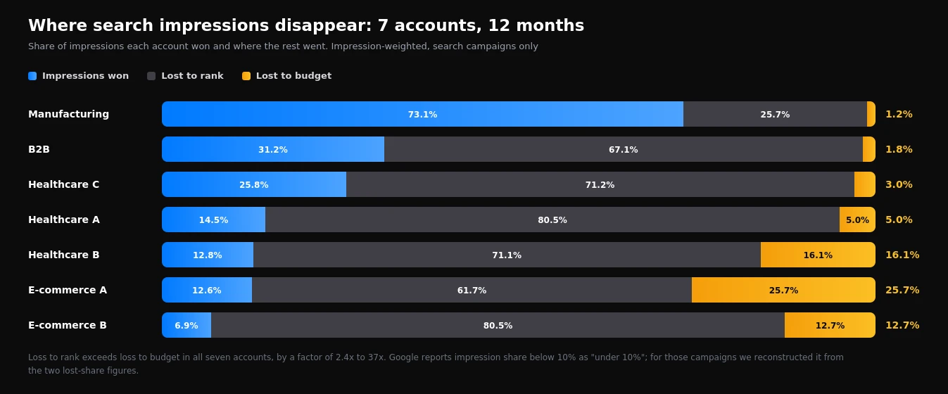
The picture is the same in all seven accounts. Between 25.7% and 80.5% of possible impressions were lost to rank, and between 1.2% and 25.7% to budget. Even in the two accounts with the highest budget loss, rank loss exceeds it by 2.4x and 4.4x. In the other five the gap is between 6x and 37x.
The practical conclusion is simple: when an account loses 70-80% of impressions to rank and 3-5% to budget, extra money will produce almost no new impressions. It will go on pricier clicks in the same auctions the campaign already enters.
Ad rank depends on the bid, expected CTR, ad relevance, landing page experience and search context. But there is a nuance that rarely gets mentioned: when a campaign runs on target CPA or target ROAS, the algorithm deliberately stays out of expensive auctions where the target cannot be met. In the report that also shows up as impressions lost to rank. So high rank loss is not always a problem. Sometimes it is a tight target working exactly as designed.
| What the report shows | What it usually means | What to do |
|---|---|---|
| Budget loss above 15%, cost per conversion within target | The campaign is genuinely capped by money | Raise the budget gradually, 15-20% a week |
| Rank loss above 60%, automated bidding with a tight target | The algorithm is opting out of expensive auctions | Test loosening the target by 10-15% and compare conversion growth against spend growth |
| Rank loss above 60%, low Quality Score | Ads or landing pages lose to competitors | Work on copy and landing pages, not bids |
| Both losses low | The campaign already captures nearly all available demand | Expand keyword coverage or look for new channels |
Finding 2. More money does not mean more conversions
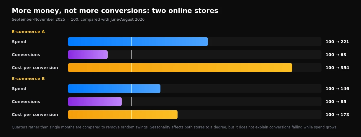
The most telling thing we saw in the audit was the trajectory of two online stores. We compared the first quarter of the period (September to November 2025) with the last (June to August 2026). We compared quarters rather than individual months to remove random swings.
| Store | Spend | Conversions | Cost per conversion |
|---|---|---|---|
| E-commerce A | 100 → 221 | 100 → 63 | 100 → 354 |
| E-commerce B | 100 → 146 | 100 → 85 | 100 → 173 |
In the first store spend grew 2.2x while conversions fell by 37%, and cost per conversion rose 3.5x. In the second, the budget grew by 46% while conversions dropped by 15%. Seasonality affects both stores to some degree, but it does not explain sales falling against that kind of spend growth.
Store A: the money moved to where each extra conversion costs more
Breaking the data down by campaign type shows what happened. In search campaigns spend tripled while conversions rose by only 31%. In shopping campaigns spend grew 3.3x and conversions by 7%. That is classic diminishing returns: the first money buys the cheapest and warmest auctions, and each additional unit of budget lands in progressively more expensive ones.
The Performance Max story is even more interesting. From September to January it was the most efficient campaign in the account. In February its spend dropped to almost zero, and from March it again received a budget comparable to the autumn. Yet over the following six months it never returned to its earlier performance: cost per conversion from March to August was 6.3 times higher than from September to January.
The data shows what happened, not why. The abrupt pause may have coincided with changes to the product feed, conversion settings or asset group structure. A collapse like this should be checked against the account's change history straight away: markets rarely fall off a cliff within a single month. But the pattern itself is instructive: pausing an automated campaign that works well is a decision whose consequences can last for months.
Average cost per conversion hides the most important thing. Calculate the marginal figure instead: the increase in spend divided by the increase in conversions. In Store A quarterly spend rose 2.2x and conversions fell. The marginal cost cannot even be calculated: each additional unit of budget bought no additional conversions at all. The practical rule: raise budgets in steps of 15-20%, wait two to three weeks after each step, and calculate the marginal cost. As soon as it exceeds what the business can afford per conversion, further budget increases stop making sense.
Store B: budget growth went into formats with no conversions
In the second store, Performance Max campaigns received only 13% more money and delivered 16% fewer conversions. Most of the growth went elsewhere.
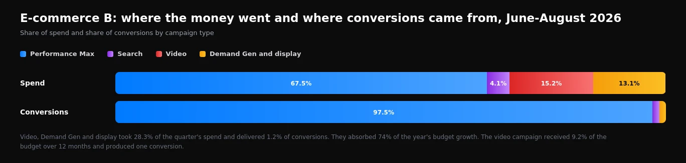
74% of the growth in quarterly spend (autumn 2025 against summer 2026) was absorbed by video, Demand Gen and display campaigns. In the last quarter they took 28.3% of spend and delivered 1.2% of conversions. Over twelve months, video campaigns received 9.2% of the annual budget and produced one conversion.
To be fair: video and Demand Gen tend to influence decisions long before a purchase, and conversion reports capture that influence poorly. Their job is awareness and demand. But if a format is launched for awareness, that should be written into its objectives and measured separately, for example through the trend in branded search queries. This account had no such check: budget kept being added while total conversions kept falling.
Finding 3. The Display Network inside a search campaign
When you create a search campaign, Google switches on the Display Network by default. The checkbox is easy to miss, and then nobody looks at it again for years.
In one of the healthcare accounts that checkbox sent 21.6% of all search campaign spend to the Display Network. That is 16,744 clicks over the year and zero conversions. A display click also cost 2.5 times less than a search click, so in a cost-per-click report that part of the campaign even looked efficient.
Open the campaigns report and add the Network segment. If any search campaign shows a Display Network row, open the campaign settings, go to Networks and untick the box. Display advertising needs campaigns of its own, with dedicated creative, audiences and budget, not leftovers from search ads.
Finding 4. Ad strength does not reflect results
The ad strength rating on responsive search ads (Poor, Average, Good, Excellent) is one of the most visible indicators in the interface. Many people treat it as a forecast of performance. We checked all 72 responsive search ads that received impressions over the year in the seven accounts running search campaigns.
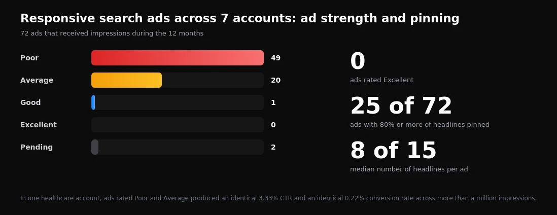
The first observation: not a single ad rated Excellent. One rated Good, and it had 12 impressions all year. 49 of the 72 ads were rated Poor.
The second matters more: the rating has no connection to results. In one healthcare account, ads rated Poor received 753,000 impressions and ads rated Average received 266,000. CTR in both groups was 3.33%, and the conversion rate was 0.22%. Identical to two decimal places.
One of the stores was more striking still: ads rated Poor delivered a 10.1% CTR and a 1.9% conversion rate, while the ad rated Average delivered a 5.8% CTR and 0.4%. The best ad in the account was formally the worst.
Ad strength measures how complete and varied an ad's assets are: how many headlines, whether they differ, whether they contain keywords. It does not measure how much the ad sells. Rewriting a well-performing ad to chase a green rating is not worth it. The useful part of the rating is different: few headlines means few combinations for the system to test.
If you are going to look at anything in your ads, look at the asset performance report. There each headline and description receives a label based on actual serving results, and that is what tells you which lines to replace and which to keep. It is work on what the system actually shows people, not on the formal completeness of the ad.
Finding 5. Pinned headlines turn responsive ads back into static ones
A responsive ad works when the system can combine headlines and descriptions for a specific query. Pinning a headline to a position takes that freedom away. Pin every headline and the responsive ad is no longer responsive.
In 25 of the 72 ads, 80% or more of the headlines are pinned. The median number of headlines is 8 out of a possible 15, and 39 ads have eight or fewer. In one of the healthcare accounts, 99.7% of search ad impressions went to ads with all or nearly all headlines pinned.
Where this comes from is clear enough. When expanded text ads could no longer be created in 2022, some specialists moved their old copy into new ads and pinned every line to its former position. Formally the ad is new. In practice it is the old one, now with a poor rating as well.
What to do: pin only what genuinely has to stay in place, such as the brand name in the first headline or a mandatory disclaimer. Even then, pin two or three variants to that position rather than one. Leave the remaining headlines free, and bring the total up to at least 12-15.
Finding 6. A low Quality Score makes a click not more expensive, but worthless
Keyword Quality Score is traditionally linked to click price: a lower score means a pricier click. We looked at what share of spend in each account goes on keywords scored 1-4.
| Account | Share of spend on keywords with QS 1-4 |
|---|---|
| Healthcare C | 86% |
| Healthcare A | 80% |
| Healthcare B | 63% |
| E-commerce A | 13% |
| B2B | 4.5% |
| Manufacturing | 1.8% |
| E-commerce B | 0% |
Share of spend on keywords for which Google calculates a Quality Score.
The split falls cleanly along industry lines. In all three healthcare accounts, keywords with a low Quality Score take between 63% and 86% of spend. In the stores, manufacturing and B2B it is between 0 and 13%.
The data does not show the cause directly, but the hypotheses are obvious. Healthcare advertising operates under restrictions on wording, so ad copy mirrors the query less closely. Healthcare landing pages are often generic rather than dedicated to a specific service. And healthcare searches are more often phrased as symptoms, which match service names poorly.
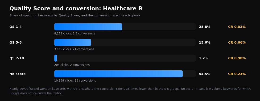
Now the most important part. In Healthcare B, keywords with QS 1-4 took 28.8% of keyword spend: 8,129 clicks and 1.5 conversions. Keywords with QS 5-6 in the same account convert 36 times better. In Healthcare A the gap between those groups is smaller, 2.7x, but the direction is the same.
Meanwhile, clicks on low Quality Score keywords in both healthcare accounts were not more expensive, but around 30% cheaper than on QS 5-6 keywords. Automated bidding lowers bids where it does not expect a conversion. That is exactly why these keywords escape attention: they look cheap.
The pattern is not universal. In one store, QS 1-4 keywords converted better than QS 5-6, and in the other the 5-6 group outperformed 7-10. Quality Score is a diagnostic, not a verdict. But if most of an account's spend goes on keywords scored 1-4, that is a reason to check whether ads and landing pages actually match the queries you are paying for.
Finding 7. Search partners: do not switch them off blindly
One of the most popular pieces of advice for search campaigns is to switch off search partners immediately, supposedly because they only bring low-quality traffic. Our data does not support that advice.
In one of the healthcare accounts, search partners took 26% of search campaign spend and delivered 394 conversions. The conversion rate there was lower than on Google Search (7.2% against 16.6%), but a click cost 2.5 times less. As a result, cost per conversion on partners came out 9% lower. Switching partners off in this account would have removed around 28% of conversions, and the freed-up money would have bought conversions on Google Search at a higher price.
In the other accounts partners took between 0.3% and 1.3% of spend, with too few conversions to draw conclusions. So the rule is not "switch them on" but "check": the Network segment in the campaigns report shows everything in a minute.
One caveat: for healthcare and service businesses, it is worth checking the quality of enquiries from partner sites in your CRM. Cost per conversion speaks to quantity, not to how many of those enquiries became customers.
What all seven findings have in common
None of these findings is about skill at bid management or copywriting. All seven are consequences of decisions made once and never revisited: the Display Network checkbox left on when a campaign was created, headlines pinned during the move to responsive ads, a video campaign launched "as a test" and forgotten, budget added without anyone calculating the return.
A Google Ads account rarely breaks all at once. It gradually accumulates settings that once made sense. That is why in all eight accounts we found problems that stay invisible in the usual weekly look at spend and conversions, but become obvious in a twelve-month view.
Seven checks for your own account
| What to check | Where to look | Warning sign |
|---|---|---|
| Why impressions are lost | Campaigns, impression share columns | You want to add budget, but budget loss is under 10% |
| Return on budget growth | Monthly report by campaign type | Spend grows faster than conversions two quarters running |
| New formats | Share of spend and conversions for video, Demand Gen, display | Over 10% of budget without a separately recorded objective |
| Display Network in search | Network segment in search campaigns | Any spend at all in the Display Network row |
| Ad structure | Ads, number of headlines and pinning | Fewer than 10 headlines, or most of them pinned |
| Quality Score | Keywords, Quality Score column | Over a third of spend on keywords with QS 1-4 |
| Search partners | Network segment, cost per conversion | Switched off without checking, or over 20% of spend without reviewing lead quality |
What this data does not prove
Eight accounts across different industries are material for conclusions about typical problems, not market statistics. Conversions are recorded correctly in only four of them, so findings 2, 6 and 7 rest on a smaller sample.
We see the numbers, but not the decisions behind them. Why the campaign in Store A was paused in February, why video was added in Store B, whether the Display Network checkbox was deliberate: none of that is visible through the API. So we describe patterns rather than looking for someone to blame.
Google reports impression share below 10% as "under 10%", and for those campaigns we reconstructed it from the two lost-share figures. That introduces a small margin of error but does not change the main conclusion: rank loss exceeds budget loss in all seven accounts.
Finally, a conversion in Google Ads is not the same as a customer. None of these findings accounts for lead quality in a CRM, and for healthcare and B2B companies that is often decisive.
This piece wraps up a series of analyses based on the same audit. Earlier we covered structural mistakes in these 8 accounts, search queries that never convert and conversion by device. How we run this kind of review is shown in the case study. If you want to know what is holding your account back, talk to our team.
Want results like this for your brand?
Get a free strategy call and a tailored proposal within one business day.
Get a Free Proposal